A better checkout is not necessarily a shorter or one-page checkout. It is a sequence shoppers can understand, complete, and recover from if something goes wrong. Start by making the path predictable, surfacing costs early, reducing unnecessary form work, and testing the full journey on mobile. Then use your own funnel data to decide which changes deserve attention; industry-wide findings are useful context, not a forecast of your store’s results.
What checkout friction should you fix first?
Checkout usability remains a widespread problem, but benchmark results do not predict any one merchant’s conversion rate. Baymard Institute’s 2025 benchmark, updated November 25, 2025, rated checkout UX mediocre or worse on 64% of desktop sites, 63% of mobile sites, and 46% of apps it assessed. Its April 23, 2026 guide reports a 70.22% average cart abandonment rate and identifies unexpected extra charges, forced account creation or a hidden guest path, lengthy or complex checkout, and unavailable preferred payment methods among reasons shoppers gave for leaving.
These are aggregate findings, not a diagnosis of your checkout. Use them to form hypotheses, then inspect your own funnel and watch how customers use the flow. Baymard’s guide also reports an average of 19.9 checkout form elements and says an optimized flow can be as short as 12. Those are form elements—not checkout steps—and the shorter figure is not a target every store should adopt regardless of fulfillment needs.
17 practical checkout optimization tips
1. Keep the order flow linear
Make each action lead forward to a distinct next stage. Avoid sending shoppers backward through repeated pages, changing the sequence unexpectedly, or making them guess what to do next. As Baymard co-founder Jamie Holst puts it, “keep your process completely linear – never show the same page twice.”
#1 Best Overall

- Use the, easy-to-use, and customizable POS to get started.
- Accept contactless payments, chip cards, Apple Pay, and Google Pay from anywhere, with improved connectivity, extended battery life, and enhanced security. Pay one low rate for every tap or dip.
- No long-term commitments or contracts, no monthly fees- and with offline payments, keep taking payments for up to 24 hours.
- Safely and securely accepts payments anywhere. Plus, get data security, 24/7 fraud prevention, and payment-dispute management at no extra cost.
- Use the, easy-to-use, and customizable POS to get started.
2. Show progress that matches the real process
If checkout has multiple stages, label them in the order shoppers will encounter them and indicate which remain. A progress bar that implies only one step is left when payment or review still follows creates a false expectation. For a one-page or accordion layout, make completed, current, and remaining sections clear without suggesting a sequence the interface does not follow.
3. Make guest checkout easy to find
Present guest checkout as a prominent, straightforward choice rather than hiding it behind account sign-in. In Baymard’s 2025 survey of 1,026 US adults who had shopped online in the previous three months, 18% said they had abandoned an order because they did not want to create an account. Its 2025 benchmark found that 62% of sites did not make guest checkout the most prominent option.
4. Offer account creation after the purchase
Do not make registration a prerequisite for placing an order unless a genuine operational requirement calls for it. Let customers complete checkout as guests, then offer a post-purchase way to create an account using information they have already provided. Explain the benefit plainly, such as order tracking, rather than blocking the purchase behind a password form.
Rank #2

- Accept all major credit and debit cards and pay one low rate
- No hidden fees and no long-term contracts
- Mobile card reader that accepts payments anywhere & anytime
- Use the free SumUp App on your smartphone or tablet to start accepting transactions
- Simply pay 2.6% +10 per in-person transaction
5. Reveal known costs before the final step
Show the running total as soon as you can calculate it, including shipping and taxes when known. If a cost depends on a delivery address or shipping choice, explain what information is needed to calculate it and update the total visibly when the shopper makes that choice. Baymard’s April 2026 guide reports that 39% of shoppers left because of unexpected extra charges; that survey finding supports transparency, but it does not quantify the likely effect of a change for any individual store.
Free tools Windows power users keep installed
One-click scans. No signup required.
6. Explain delivery options and timing
Describe shipping choices in terms a shopper can compare: cost, estimated delivery window, and any meaningful conditions. If pickup is available, state where and how it works. Avoid vague labels such as “standard” without enough detail to make the trade-off clear, and do not show an estimated arrival as a guarantee unless your fulfillment terms support that promise.
7. Keep the order summary accessible
Give shoppers a clear way to verify the items, quantities, discounts, and total before placing the order. On narrow screens, a collapsible summary can save space, but its label and total should remain easy to find. If shoppers can edit the cart from checkout, preserve their place in the flow where possible.
Rank #3

- Accept all major credit and debit cards for one low rate.
- Accepts Visa, Mastercard, Discover, and American Express—no hidden fees.
- Track your earnings and view your complete sales history from the free Square Point of Sale app.
- Works with Apple and Android devices that have a 3.5 mm headphone jack. No charging needed
8. Remove fields that are not needed
Ask only for information required to fulfill, bill, or lawfully process the order. Remove redundant fields, make apartment or company details optional when appropriate, and do not collect marketing information as if it were necessary for purchase. Review the form from the customer’s perspective: each extra field adds effort and can raise questions about why the information is needed.
9. Use persistent labels and sensible field order
Keep field labels visible after someone starts typing; placeholder text alone can disappear and make a filled field hard to identify. Arrange fields in the order people naturally provide the information, group related details, and make required versus optional status clear. On phones, choose input types and keyboard layouts appropriate to the data, such as numeric entry for a card number where supported.
10. Support autofill and avoid repeated questions
Use standard, recognizable field semantics so browsers and supported services can autofill contact and address details. Do not ask the customer to enter the same address twice if a billing address can reasonably be copied from the shipping address, and provide a clear way to change it when needed. Test autofill on the browsers and devices your customers actually use; do not assume it works because fields look familiar.
Rank #4
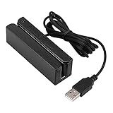
- MSR90 is a USB emulation keyboard interface that not need any driver or software,USB simply plug and play
- Reads up to 3 tracks of information,can reads ISO7811, AAMVA, CA DMV and most other card data formats
- Threaded inserts for mounting. LED indicator, green light is on when connecting,green light blinks when cards swiped
- Bi-directional swipe reading, superior reading of high jitter, scratched, and worn magstripe cards, reliable for over 1,000,000 card swipes
- Configuration software makes configuration changes easy,works with: Windows OS and Mac OS
11. Make payment choices understandable
Offer payment methods that make sense for your customers and market, and describe any relevant differences before selection. Keep choices scannable rather than presenting an undifferentiated list. Baymard’s April 2026 guide reports that 10% of US online shoppers in its cited research abandoned checkout because their desired payment option was unavailable. That does not mean adding every possible method will help every store; evaluate demand, operational fit, and the resulting checkout experience.
12. Explain when payment leaves your site
If a payment option sends the customer to another service, say so before they choose it and make the next action clear. Identify the provider where appropriate and explain whether the shopper will return to your store to confirm the order. An unexplained change of domain or interface can look like an error or an unsafe detour.
13. Make card entry forgiving
Accept common card-number formatting, including spaces or hyphens if your payment setup supports it, and avoid forcing shoppers to conform to an unnecessarily rigid format. Label expiration and security-code fields clearly, and explain the expected format when it is not obvious. Validation should help customers correct an entry, not reject harmless formatting differences.
Recommended Free Tools
Best Value

- Fully Compliant - Complies With All Major Industry Standards, Including Iso/Iec 7816, Usb Ccid, Pc/Sc, And Microsoft Whql. As Well As, Emv 2011 Ver 4.3 Level 1 And Gsa Fips 201.
- Seamless Integration - With Identiv-Specific Smartos You’Ll Get Easy, Complete Support Of All Major Contact Smart Card Ics And Technologies In One Simple Reader.
- Universal Compatibility - Works With Virtually All Contact Chip Cards And Pc Operating Systems, Including Windows, Macos, Linux And Android.
- Fast And Convenient- Shorten Your Transaction Time With A Reader That’S Optimized For Speed. It’S Ultra-Compact And Robust Design Is Streamlined For Mobile Operation, Making This Reader The Best Choice For Convenience, Security And Reliability.
- Ergonomic and cost efficient design
14. Make errors specific and preserve entered information
Place a clear explanation beside the field or issue that needs attention, state how to fix it, and keep the information the shopper already entered. Avoid generic messages that require customers to guess which detail failed. If a payment cannot be processed, distinguish a correctable input problem from a declined transaction and provide an appropriate next step without exposing sensitive payment data.
15. Test the entire mobile flow, including the open keyboard
Check checkout on small screens from cart through confirmation, not just the first form view. Verify that fields, buttons, totals, validation messages, and the order summary remain usable when the on-screen keyboard is open. Baymard’s 2025 benchmark found mediocre-or-worse checkout performance on 63% of the mobile sites it assessed, making mobile behavior a distinct area to inspect rather than a desktop afterthought.
16. Put trust and policy information beside the decision
Place relevant details—such as delivery and return terms, customer support access, or how payment is handled—near the choice they help a shopper make. Keep claims accurate and consistent with your actual policies. A visual trust mark is not proof of security or regulatory compliance; verify any compliance claim against current primary standards documentation and your payment provider’s requirements.
17. Find friction in your own funnel and validate changes
Track the stages of checkout so you can see where customers leave, and compare patterns by device, payment method, and other useful segments when your data supports it. Combine analytics with customer feedback or usability observation to understand why a stage is difficult. Change one meaningful part of the experience at a time when practical, define the outcome you expect, and assess the result against your own baseline rather than assuming an industry statistic guarantees a lift.
Quick wins for a faster PC:
Clear out junk files and repair common Windows errorsFree Scan →Scan for outdated or missing drivers - takes under a minuteDriver Scan →Should checkout be one page or multiple steps?
Neither format is automatically better. A one-page layout can make the whole process visible, but a long, dense form may feel burdensome, especially on mobile. A multi-step flow can make a complex order feel manageable, provided each stage is clearly named, progress is accurate, and shoppers can review or correct earlier information. Accordions and platform-provided patterns also need to be judged by the same usability questions.
When comparing formats, check whether the sequence is clear, total costs are visible, guest checkout is prominent, fields are relevant, autofill works, payment choices and redirects are understandable, errors are recoverable, the order can be reviewed, mobile use is comfortable, and each stage can be measured. Choose the version that meets your customers’ needs and lets them complete the purchase with confidence—not the one with the fewest screens by definition.
Quick Recap
Sources and further reading
- Baymard Institute: The Checkout UX Guide, published April 23, 2026.
- Baymard Institute: Checkout UX 2025: 10 Pitfalls and Best Practices, published November 13, 2024 and updated November 25, 2025.
- Baymard Institute: E-Commerce Cart & Checkout Usability Research.
- Shopify: Ecommerce Checkout Best Practices: 10 Tips for Success (2026).
Product prices and availability are accurate as of the date/time indicated and are subject to change. Any price and availability information displayed on Amazon at the time of purchase will apply.